Palena

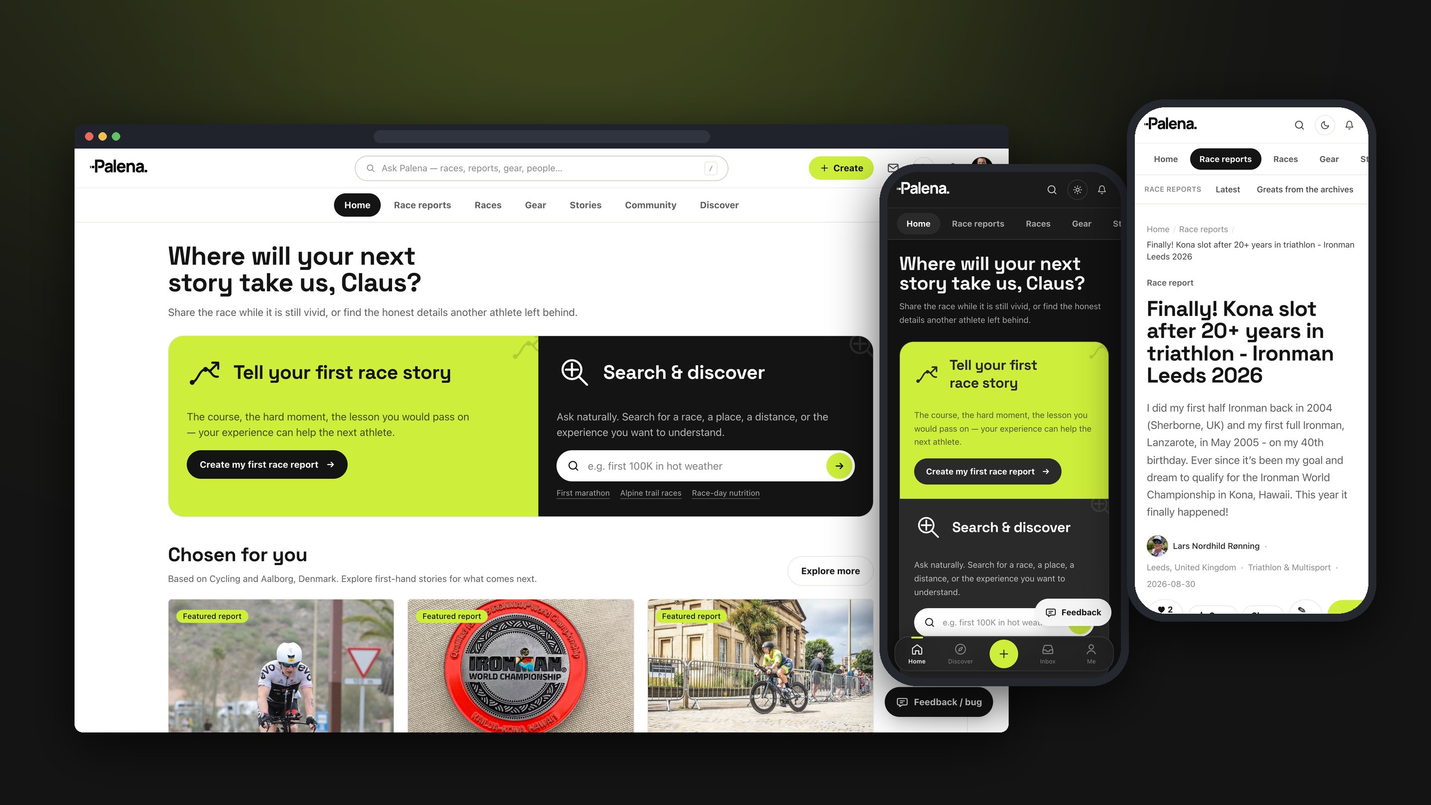
Palena — the dashboard on desktop, with the dark dashboard and a race report on mobile
Project
Palena
Role
Product Design · Design System
Location
Remote
Focus
Sport Tech
Timeline
2026 — present

Every finish line has a story

Training apps are very good at numbers and very bad at stories. They know your pace at kilometre thirty; they have no idea that you were sick at the aid station, that the course changed overnight, or that the descent everyone warned you about was nothing compared to the wind on the way back.

Palena is built for the other half of the race. Athletes write up what actually happened — the training, the race, the highs and the lows — and the next person lining up for the same event can read it before they start. Stories over stats, written by athletes for the athletes who come next.
Designing for the reader and the writer

A race report has two audiences with different needs. The reader arrives from a search, looking for one race and one answer, and needs to judge quickly whether a report is worth their time. The writer has just finished something hard and needs a way to tell it that does not feel like filling in a form.

So reading is editorial: a large headline, the athlete and the event up front, the key numbers — distance, finish time, result — in a single row, then long-form text and photos with room to breathe. Writing starts with a choice of starting points: free writing, guided prompts, or importing an existing blog post, Word document or PDF, so a story already written somewhere else does not have to be typed again.

Finding the right race

A report is only useful if the right person finds it. Events sit in a sport taxonomy that drills from a sport down to a discipline, category, event brand, event and edition, so a report on one year of one race connects to every other year and every similar race.

Search runs across reports, events, athletes and destinations at once, with facets for type, sport, country and year. Discover gathers the same content into entry points — race reports, stories, races, gear and coaches — for the athlete who does not yet know what they are looking for.

One system, two modes

Every screen is assembled from the same tokens and components. Colour lives in variables with light and dark modes — sand surfaces and ink text by day, near-black by night, with a single lime accent doing the work of calls to action, active states and highlights in both.

Headings are set in Space Grotesk with tightened tracking; body and interface text use Inter. Radii and spacing run on a fixed scale, and the signed-in shell is the same everywhere: an app bar with the search field, an icon rail on the left, a friends rail on the right, and a single content container between them.

The Figma library is a mirror of the build as it stands — the same tokens, the same components, and the end-to-end flows assembled from them — so design and code describe the same product rather than two versions of it.

Related projects